Overview
ZS Associates is a professional services firm that works side-by-side with companies to help develop and deliver products that drive customer value and company results.
They leverage their deep industry expertise, leading-edge analytics, and technology strategy to create solutions that work in the real world. While ZS is passionately committed to helping companies and their customers thrive (after decades of doing what worked for them), problems began to emerge as we assessed the shortcomings and opportunities in their digital ecosystem.
Solutions
Brand, Web, & Design System
The Problem
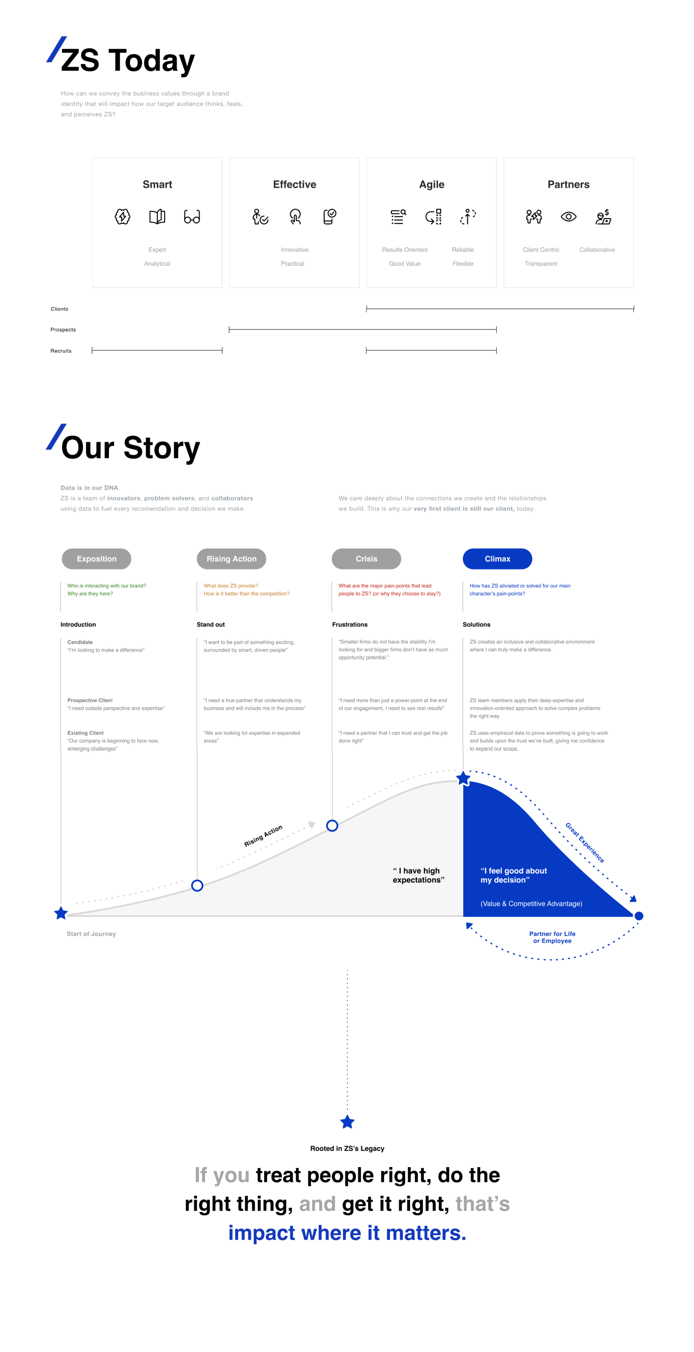
For the last 35+ years, ZS has made a huge impact in the healthcare industry. As such, their corporate design language diluted to a non-functional and print-focused system that was unable to be used by their internal UI/UX and product teams.
Although, initially I was tasked with designing their new online presence - the team quickly realized that there were major accessibility issues with their outdated brand guidelines. In order for their new online presence to succeed, we had to bring their brand and design language to the digital age.
Our primary focus was to find a cross-generational narrative and design system that spoke for clarity and inclusivity. As part of the top 3 business needs, ZS wanted a solution that would resonate with North American and Indian job/business markets. We interviewed over 30 people across the organization and created a matrix with needs, wants, and pain-points, which we later distilled further and prioritized based on geography.

Gen Z
Born in eCommerce, AI, IOT, & beyond.

Gen Y
The explosion of product and big-tech.

Gen X
They dared to be different.
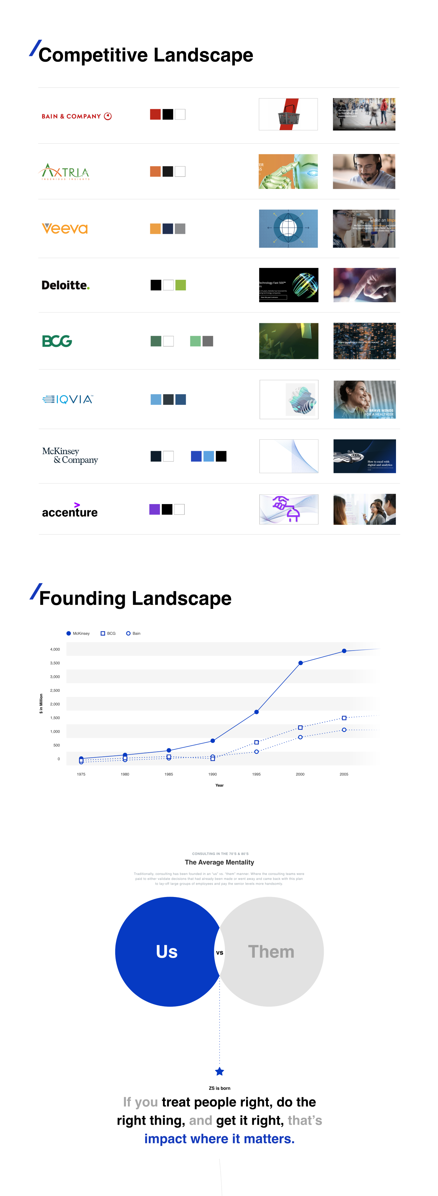
The Competition
The team started by understanding the competitive landscape. We knew where ZS wanted to be and how they wanted to present themselves. We also knew that unlike other firms, ZS has a notable history of doing the right thing and treating people right.
So, as we compared the inherent similarities between firms and their brands, we also identified where we could make a difference and successfully reintroduce an improved and more innovative ZS narrative that spanned across a three-generational audience.
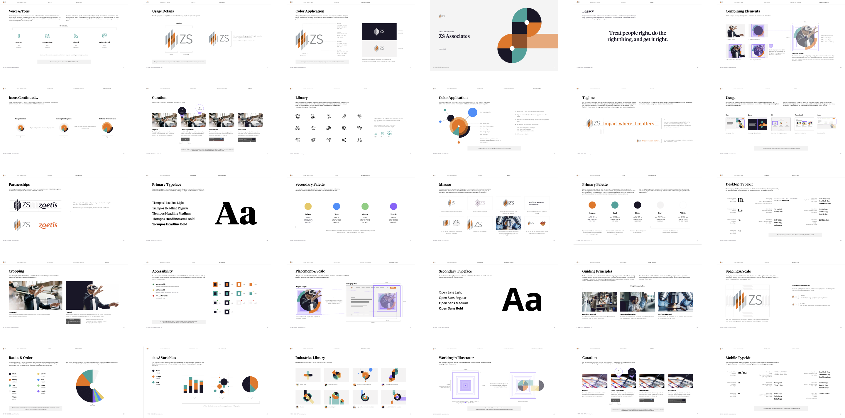
Once we landed on voice & tone, logo, typography sets, color, Illustration, and photography that resonated well, we began crafting the ZS story and design system through a concept metaphor called “The Path”.
The Solution
One of the main focuses of their new identity was to modernize and warm up a once cold ZS. The Desktop and Mobile experiences were created to simplify an otherwise complex rabbit-hole of partial information, service bundles, products, business processes, and in-house generated content. Using years worth of analytics, the team restructured their information architecture, search queries, and page indexes; white-boarding, wire-framing, testing and prototyping a delightful user-friendly experience for multinational and multigenerational audiences.
Our branding solution was designed to present ZS as the trusted advisor showing the way, walking side-by-side during the journey - from beginning to end and beyond - supplying knowledge and sharing deep expertise. Our design system lent a seamless transition for their internal product teams to build on and adapt to their needs. In order to highlight ZS’s commitment to diversity recruitment we produced a high-contrast design system that branched off into color usage specifications, illustration guidelines, and a photography curation processes.
The responsive web solution focuses on leveraging micro-interactions to help guide the eye through a dense, informative, but highly intuitive experience.
Lessons Learned
Similarly to Accenture and McKinsey; ZS wanted to reinvent what it meant to be them (a ZS’er).
By researching everything that made a company great in the past you can leverage certain anecdotes to genuinely connect with your audience(s). By understanding your core users you can find or create effective touch-points to prompt action and increase engagement. By connecting ZS’s bold approach to consulting and innovation to their human-inclusivity philosophies, we were able to create a high-contrast visual language that was equally as elegant and energetic.
The Corporate Brand Guidelines and Digital Component Guidelines all meet (W3) AA Accessibility standards across all digital products.