The Challenge
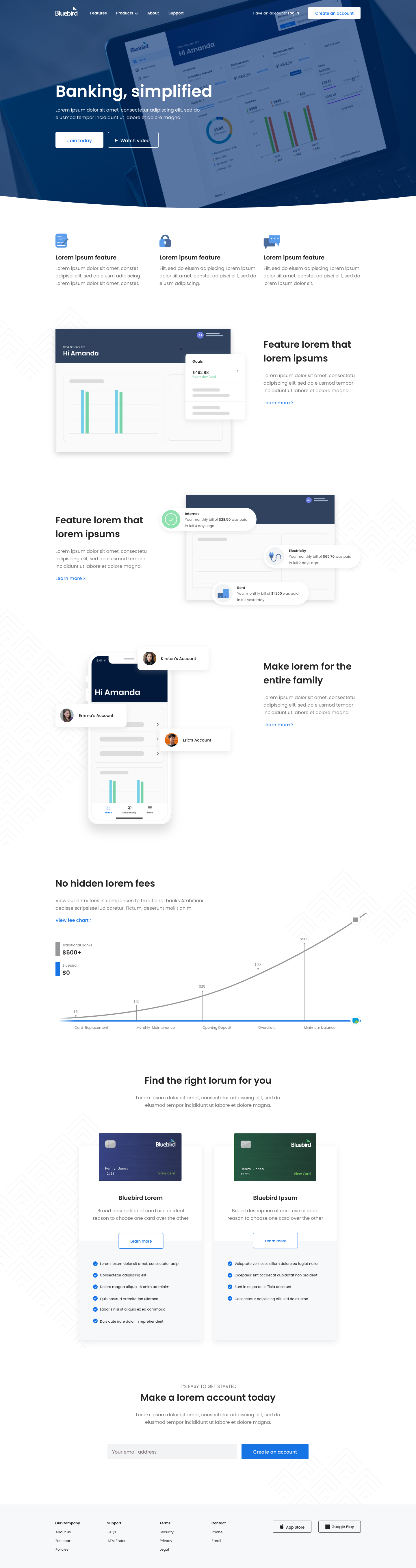
Traditional brick and mortar banks are known for their fee-generating creativity. Bluebird is an FDIC-insured prepaid debit card with virtually no fees. It functions like a checking account, making it a useful substitute for consumers who don’t want to rely on big bank rules and regulations. While Bluebird was already known for their appealing family-friendly money management tools, they began seeing massive shifts in turnover rates and marketing ROI.
They were able to pinpoint that more than 60% of customer prospects (reached by mail or email) dropped-off during the online enrollment process. Bluebird engaged my team to identify areas of opportunity in the overall user journey; starting with registration and ending with a money deposit or transfer.
After interviewing a diverse set of users, we realized that frustrations were rooted on Bluebird’s outdated user interface which was described as “ugly and confusing", forcing them to either go to physical store or drop-off entirely. Once we identified five main areas of opportunity throughout the digital customer experience, we were tasked with a full revamp of their cross-platform solutions.
Solutions
Web, Product, & Design System

Introduction
One of the benefits of working with Bluebird was their incredibly detailed understanding of middle America.
As we continued to explore user behaviors and identify the user goals of an “anti-banking” demographic, we quickly realized that the purposeful detachment from conventional banking went beyond the hidden-fee collection tactics. Out of the one-hundred potential and existing customers we interviewed, 90% were loyal users of popular payment services like PayPal, CashApp, and Venmo.
Bluebird was capitalizing on a very knowledgable but “forgotten” demographic. This realization inspired our team to rethink our initial approach which mainly revolved around simplification. We began by stress-testing flows of prominent apps that were preferred by our users. After identifying the most familiar and user-friendly flows, we commenced the reverse engineering process to understand how we could leverage familiarity to optimize usability, while meeting business needs.
After weeks of ideation, prototyping, and testing, we were able to identify the five core-flows which would meet 90% of user expectations while giving Bluebird the competitive edge they had been looking for.
A Unified Solution
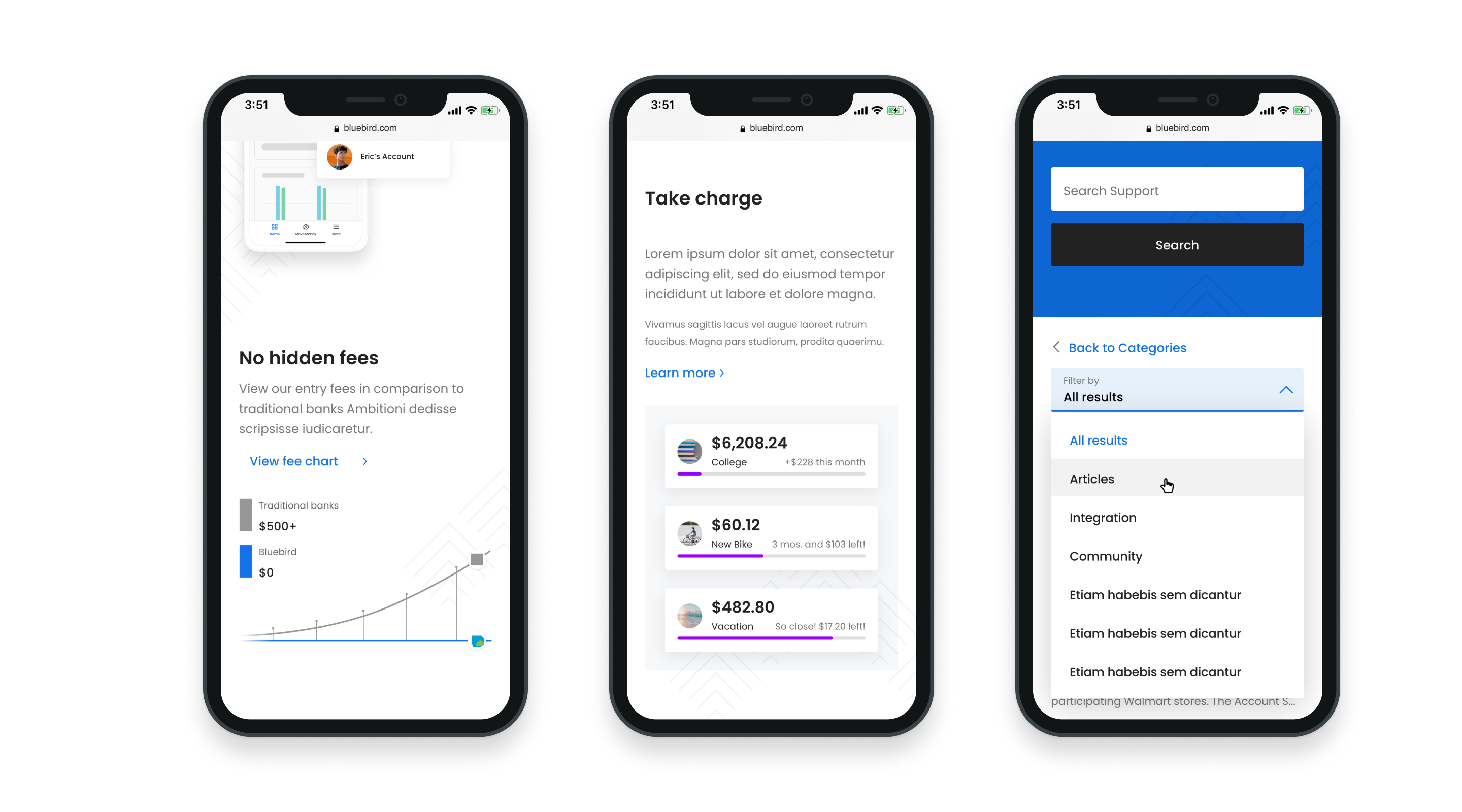
Once we solidified the user flows that would meet user and business needs, we began the cross-platform design phase which required various iterations and versions of the same screens. One of the most challenging aspects of the unification process presented itself with app features like real time data visualization, where native iOS and Android UI elements conflicted with one another.
After a thorough analysis of Apple’s Human Interface Guidelines and Android’s Material Design Guidelines, and our commitment to industry best practices and innovation, we came up with a design system that consisted of shared vs. custom components. The components library was exhaustive and took into consideration Androids’ full list of devices with their individual screen sizes and navigational attributes.
Alongside our development team, we were able to test our designs on over ten different devices, each time identifying small heuristics issues or conflicts. This process is still ongoing as the project life-cycle has now rolled-over into new versions of both Android and iOS.

Lessons Learned
Successfully designing for a cross-platform digital solution goes way beyond empathy to solve a problem for a user.
The intricacies weaved into the cross-platform digital project lifecycle become denser as time goes by. There’s an accumulation of considerations and tradeoffs that happens when attempting to design a complex system that meets user and business needs equally, but must function differently.
If I could do it all over again, I would start with the less desirable platform for designers; Android. As it turns out, Apple has some of the best and most comprehensive and intuitive interface guidelines, making it a joy to design for. However, translating some of those effortless attributes to a more limited and rigid system made it feel as though we were solving some of the same problem over and over again.