Introduction
During the cryptocurrency boom and bubble (2017-2021), a small team of engineers built a Github-gated website to fund Public Goods using an innovative funding mechanism called Quadratic Funding. From that experiment, a Grants Program was born; running quarterly rounds which consisted of four phases: Project creation, Grant application, Donation, and Distribution of funds.
While the Gitcoin Grants Program was built to empower communities in funding public goods projects, that ability was hindered by significant user experience issues. The UX was designed so that each phase replaced the previous one as the round progressed — creating broken processes, missing status details, and massive usability issues leading to confusion, frustration, and high drop-off rates.
For a year, I led product design to build an entirely new web3-native user experience. I collaborated closely with engineering teams and project managers to rethink the end-to-end user journey by leveraging a tech stack that would support an open-sourced interoperable protocol. My primary objective became investigating critical issues caused by organizational missteps, identifying user pain-points, and overall system inefficiencies.
Role
Lead Product Designer
Solutions
Web App & Design System
The Approach
We began by setting high-level metrics for success. Including shortening time on tasks (e.g. connecting a wallet, switching networks, applying for a grant), as well as increasing phase-completion rates (e.g. create a project, apply for a grant, create a grant program), improving trust, increasing user satisfaction, and most importantly; increasing donation conversions.
My initial research consisted of a full UI audit, competitor analysis, and user interviews with stakeholders across various continents to help define common themes, cross-culturally. I then segmented users by: donor, grant operator, and project owner. This allowed the team to aske better questions and collect rich qualitative data on persona-based user pain points, needs, and motivations. I then conducted an analysis of user interaction data to identify common drop-off points, consistent paths taken, and highly engaging events. The cross-analysis of both qualitative and quantitative data revealed insights in user behaviors and opportunities that were pivotal in reframing the initial thesis.
I led various white-boarding activities with the help of product experts to align stakeholder expectations with insights and opportunities, understand tech constraints, and define our "decentralized" go-to-market strategy. I also co-led design thinking sessions every couple of sprints, using first-principles thinking to question assumptions, revisit old and new research data, and strategize on what to keep, pivot, or innovate.

The Solution
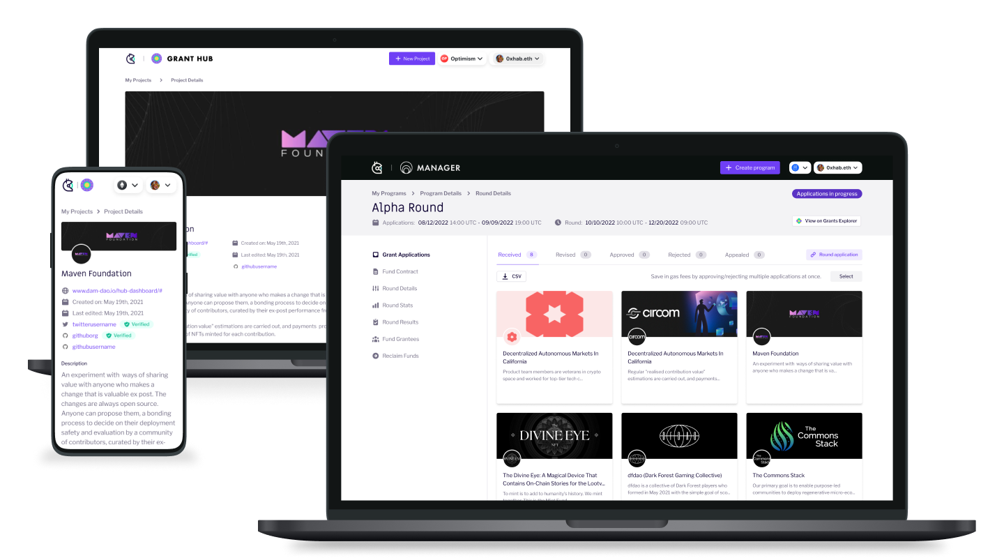
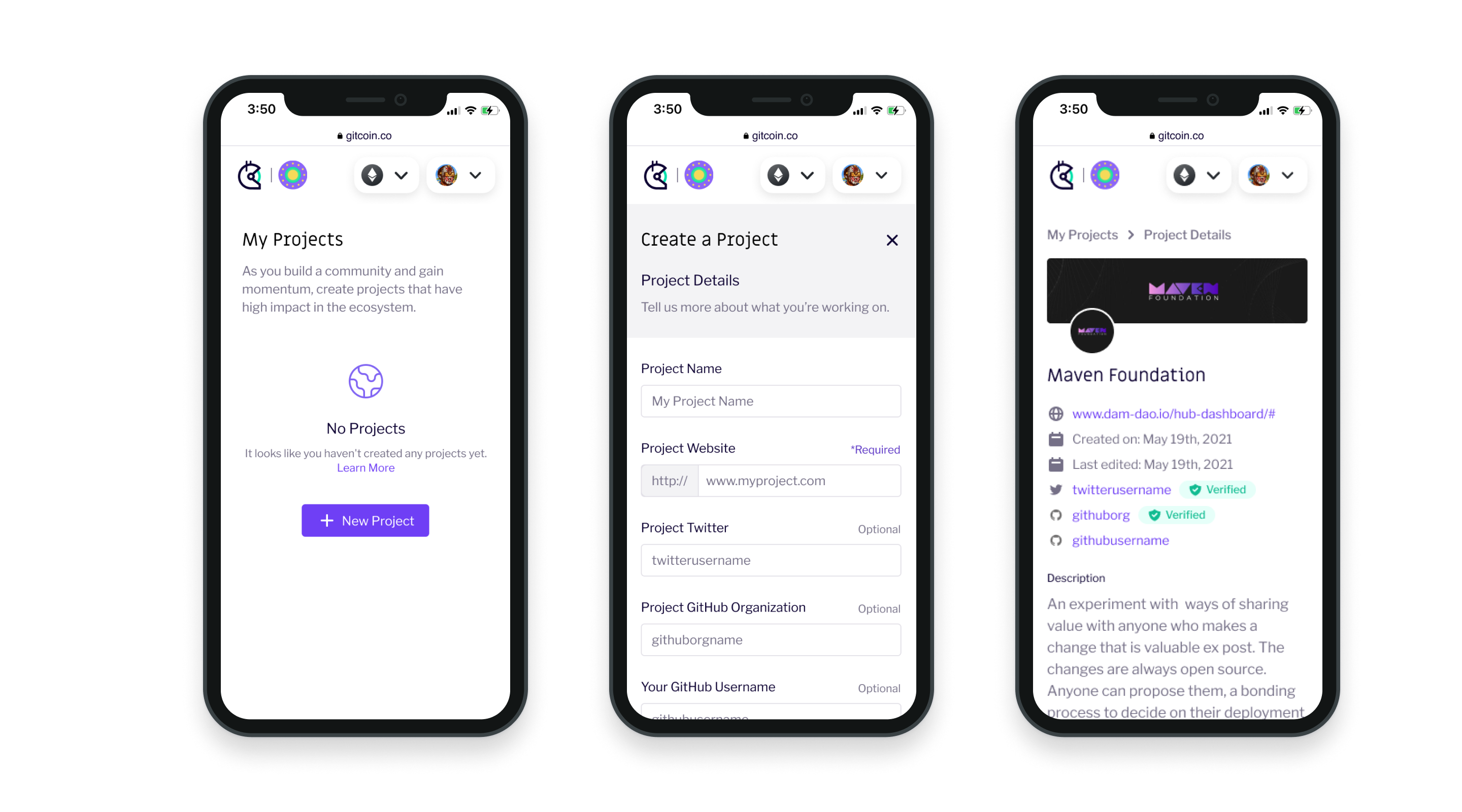
During the first six weeks of rapid iteration and testing, we concluded the most scalable solution that aligned with user expectations was to build 2 distinct products. The Project Builder (previously Grant Hub) experience allowed project owners to create multiple projects, build reputation, and apply to grants across a multiple chains. The Grant Manager gave grant round operators the ability to run multiple rounds with different donation models, while providing full round analysis, stats, and on-chain distribution of funds. To move fast, we leveraged Tailwind UI; creating our own design system by adjusting the CSS to match our exiting brand guidelines.
By the launch of the decentralized "Alpha" pilot grant round, our team had achieved a 94% passing score in the system usability scale, aligning usability heuristics and user expectations to system outcomes. The 6% margin of error was regarding external factors like wallet UX and third-party providers (Mainnet, Ceramic, IPFS, etc), which we added to the roadmap. By vastly simplifying the user journey and providing a clear, 0 to 1, step-by-step guidance, owners and operators could now create projects and manage grant rounds with greater ease, leading to successful grant distributions.
With the release of the Grant Manager, we opened a realm of possibilities for native and non-web3-native organizations interested in creating and running a grant program on-chain. The MVP was made to run a single round and funding mechanism (quadratic funding), but designed to scale and allow a diverse set of round parameters, project acceptance criteria, industry categories, chain options, and funding mechanisms. The modularity baked into the UI, strengthened usability, increased trust, and unified the product suite for the launch of a glorious Gitcoin 2.0.
The Lessons
The redesign significantly improved user engagement and donation conversions. Post-launch, Gitcoin partnered with major organizations like UNICEF and CoinBase, further solidifying its impact on funding public goods. The modular design of Project Builder and Grant Manager allowed Gitcoin to efficiently scale its operations, accommodating a growing user base and diverse funding mechanisms without sacrificing user experience.
However, if I could do it all over again, I would do a deeper dive into web3 communities. As it stands, web3 is incredibly community focused, so taking a traditional user-based approach to the research felt too wide reaching and often generated outlier data-points difficult to reason with. Targeting users by community would have added a deeper dimension to our personas giving us a stronger chance at asking better questions and framing better opportunities.